Anyway A man who is losing his house in the morning and reach in evening in house you can not say him the loser :D
Actually in last one -two months i am working on mobile site and apps and found very interesting things. I will share my experience here in my coming posts. So enjoy reading and be sure to leave comments here.
In Feb 1993, Marc Andreessen had requested for new HTML tag, the proposal was proposal for image basically about
According to the HTTP Archive http://httparchive.org/interesting.php,the average web page is 1292 KB, with 801 KB of that page weight — more than 60% — being taken up by images. In shiksha its around 50 -60%. we have seen many algorithms for image optimization http://www.netmagazine.com/features/best-image-compression-tools
Then i found WebP :-) really i appreciate Google Engg. who are trying to make our life easier ...
So here are my findings.
- Lossy and lossless compression
- Transparency (alpha channel)
- Great compression for photos
- Animation support
- Metadata
- Color profiles
Gmail, Drive, Picasa, Instant Previews, Play Magazines, Image Search, YouTube, ...) with WebP support. Most recently, Chrome Web Store switched to WebP, saw ~30% byte reduction on average, and is now saving several terabytes of bandwidth per day!
Back to basic:
A digital photograph is made up of millions of tiny dots called pixels. For example, one camera might produce photos that are 2272 pixels wide and 1704 pixels tall (2272 x 1704). Another camera will produce an image that is 4492 x 3328. You can find out the number of megapixels by multiplying the horizontal and vertical pixels. In the first example, the camera captures about 3.9 megapixels (2272 x 1704 = 3,871,488). In the second example, the camera captures about 15 megapixels (4492 x 3328 = 14,949,376).
Computer monitor generally displays images at 72 pixels per inch. This means that our 3.8 megapixel image is going to measure about 32 inches by 24 inches when viewed on a monitor. We can determine the display size of the image by dividing the horizontal and vertical pixels by 72.
In this case, 2272 / 72 = 31.6 and 1704 / 72 = 23.7.
Use the 72ppi standard when you want to post an image to the Internet.
But printer needs to use more pixels per inch to produce a high-quality image than our monitor does. If print a photo at 100ppi, it is not going to look like a professional print. You will be able to see grain and fuzziness, the actual pixels that make up the digital photograph. If we print at 250ppi, it increase the pixels per inch, so it reduce the size of the printed photo. Let's say you print 3.9 megapixel photo at 100ppi. This isn't high-quality, but you can print a photo that measures 22.7 by 17 inches (2272 / 100 = 22.7 and 1704 / 100 = 17).
Now you print the same photo at 250ppi. You get a great looking photo, but the print size is 9.1 by 6.8 inches (2272 / 250 = 9.1 and 1704 / 250 = 6.8).
Hope you enjoyed little bit maths that we did above but hold on ... Now screens are changed ..
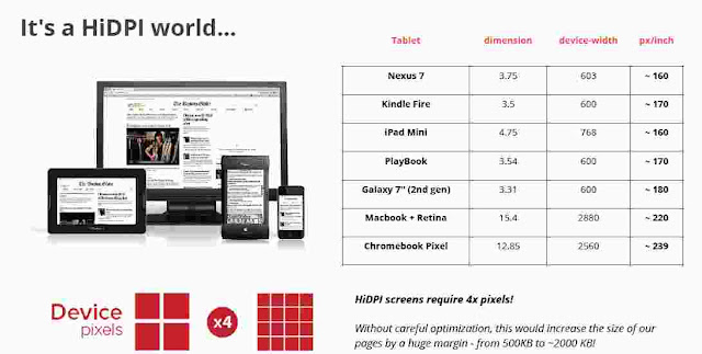
iOS devices measure density in PPI (pixels per inch) and Android in DPI (dots per inch). The more pixels or dots you fit in one square inch on a screen, the higher the density and resolution of it.
The original iPhones and iPads had a screen density that was classified as non-retina. The current generation of iOS devices sport higher density displays referred to as retina. Android devices have evolved from low density, ldpi, all the way to extra high density, xhdpi.
There are five widely used densities across iOS and Android devices, which fall into four progressively larger groups:
- non-retina (iOS) and mdpi (Android)
- hdpi (Android)
- retina (iOS)
- xhdpi (Android)
Scaling the UI elements of your design and understanding how an asset at one density would scale to another can be confusing at times.
According to the official Android “Supporting Multiple Screens” documentation:
- xhdpi = 320dpi
- hdpi = 240dpi
- mdpi = 160dpi
- ldpi = 120dpi
- Retina iPhones = 326dpi (roughly equivalent to xhdpi)
- Retina iPads = 264dpi (roughly equivalent to hdpi)
See more details here. http://developer.android.com/guide/practices/screens_support.html
So we have seen here some basic ABC about images pixels, ppi and dpi. So image can be render with diff resolutions in diff screen density.
Will back with more details about responsive image rendering with all possible options. Till then enjoy reading and happy learning !!!


